Text und Typografie.
Lernen Sie, wie Sie Texte schreiben, die informieren, gut wirken und sich leicht lesen lassen.
Lektionsinhalt
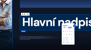
Headings, subheadings & paragraphs
Short and to-the-point headlines grab attention — helping your visitors find exactly the information they're looking for. This will make your pages clearer.
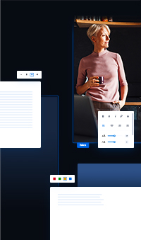
Add a heading, subtitle or paragraph with the plus button.
Use headings and paragraphs of similar length within a single section — visually balanced content is easier to read.
Text alignment & layout
Left-aligned text is easier to read because the beginning of each line is in the same place.
Center alignment is best for short titles only.
Text that has the same alignment appears as a whole.
You can limit the width of the text by dragging the handle.
Text color
Decide which one colors you want to use (ideally a ratio of 60:30:10).

Text style
Decoration
Highlighting only works when everything is not highlighted.
People prefer to read short paragraphs.
Erstellen Sie Ihre
eigene Website
Eine professionelle Website erstellen Sie ganz leicht. Starten Sie jetzt und nutzen Sie 30 Tage kostenlos zum Ausprobieren.
Keine Kreditkarte erforderlich.