Die Kraft von
Weißraum.
Warum ist Weißraum im Design wichtig? Sehen Sie, wie ein passendes Layout Ihre Seite klarer macht.
In dieser Lektion

Empty space creates structure, hierarchy and harmony
The space that remains unfilled on the page is called in the design "white-space". It includes parts of pages without content as well as space between elements. Although it may seem like a waste of space, it performs essential functions:
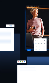
Add white space around any element by setting the margins in the tab Location and layout ![]() .
.
The content also wants to breathe
The empty space makes it easier for the observer to focus on a specific point. The bigger the margins you set, the sooner visitors will notice the element.
Give the most space to what should attract the most attention.
What is close together appears as a whole
The brain does not perceive the web as a collection of loners, but as interconnected composition. Elements close to each other act as one team. We use this for the logical division of content.
You express the visual division of groups using vertical spaces:
Largest gaps: between main sections (e.g. Price List vs Gallery)
Medium gaps: between subgroups (price list categories)
Small spaces: between individual items
The finer the division, the smaller the gaps
If all the gaps were the same, the eye wouldn't know what belonged to what. The deeper you go into the structure, the smaller the gaps you use.
Maintain a hierarchy of spacing for logical visitor orientation.
Create a visual rhythm
People love patterns. If you set a certain distance between the title and the text, use it like this everywhere. By repeating the same spacing, you create a harmony in which the visitor can intuitively orient himself.
- Equal spacing between sections
- Same margins for columns
- The same gaps in the gallery
- Same paddings for buttons
In saywebpage, spacing and margins are already set for you — you don't have to worry about it.
Sometimes it's better to overdo it
Pages will look better if they have "excessively" large margins rather than having elements pushed together. Add white space when you want to make the site clearer.
1 Empty space creates hierarchy and rhythm.
2 Larger spacing will make your pages clearer.
3 White-space draws attention to the important.
4 Uniform spacing facilitates orientation.
Erstellen Sie Ihre
eigene Website
Eine professionelle Website erstellen Sie ganz leicht. Starten Sie jetzt und nutzen Sie 30 Tage kostenlos zum Ausprobieren.
Keine Kreditkarte erforderlich.